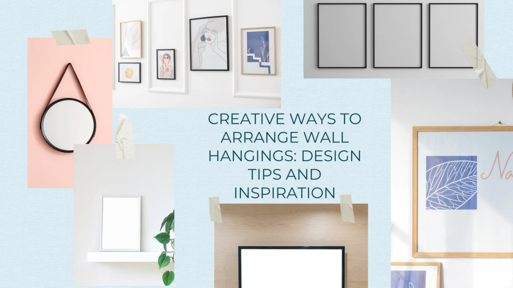

Figuring out how to arrange wall hangings is one of those projects everyone assumes they’ll just “eyeball,” right up until the fifth nail hole shows up in the wrong spot. The good news: there’s a real method behind the gallery walls that look effortless, and none of it requires a design degree.
In this guide, we’re covering the creative side and the practical side together. You’ll get the styling ideas that make an arrangement feel curated picking a theme, mixing frame styles, playing with geometric layouts and layering plus the measurements and hardware know-how that keep everything looking professionally hung instead of slightly off.
READ ALSO: How to Hang Something on the Wall
Plan Before You Hang
Every great arrangement starts on the floor, not on the wall. Skipping this step is the single biggest reason gallery walls end up with extra nail holes, awkward gaps, or a layout that looked fine in your head but feels crowded once it’s actually up planning first is what separates a wall that looks curated from one that looks like a series of last-minute decisions.
Choose a Theme First
Start by picking a loose theme for the grouping family photos, travel souvenirs, abstract prints, or a single color story. A theme is what makes a wall of different pieces read as one intentional display instead of a random collection. It doesn’t need to be rigid: “warm neutrals” or “black-and-white travel shots” is plenty specific to guide your choices without boxing you in, and it gives you an easy filter for deciding what to leave out not everything you own needs to make the wall.
Measure Your Wall Before You Measure Your Art
Before you even lay pieces out, take stock of the actual wall: its width, its height, where outlets or light switches sit, and how much furniture is already eating into the space. This tells you your real working area and prevents the common mistake of planning a layout that’s technically beautiful but too wide, too tall, or interrupted by a switch plate once it’s on the wall.
Lay It Out on the Floor First
Set your pieces on the floor ideally on a rug or in front of the actual wall and arrange them the way you’re picturing them hung. Moving frames around on the ground costs nothing; moving them around on a wall costs a patched hole every time. Take a photo of your floor layout from directly above once you’re happy with it, so you have an exact reference to work from once you start hanging.
Trace It or Tape It Before You Commit
For extra confidence, trace each piece onto kraft paper, cut out the shapes, and tape them to the wall in your planned positions or skip the tracing and just mark the outlines directly with painter’s tape. Either method lets you stand back, walk past it a few times over a day, and adjust spacing or height before a single nail goes in. This is also the easiest way to catch an off-center arrangement or a piece that’s slightly too high, since it’s far more obvious from a few feet away than it is up close while you’re holding a level.
Use the Right Tools to Make It Easier
A tape measure, a small level, and a pencil for lightly marking hook positions will save you more time than any amount of eyeballing. If you’d rather test digitally before touching the wall at all, several free room-planning and augmented-reality apps let you place virtual frames against a photo of your actual room useful for getting a feel for scale and color before you commit to a physical layout.
The Measurements That Make an Arrangement Look Professional
Once you’ve got a layout you like, a few numbers keep it looking pulled-together rather than accidental.
Hang at Eye Level 57 to 60 Inches
The center of your arrangement should land roughly 57–60 inches from the floor, the standard eye-level height. Treat it as a starting point rather than a hard rule — adjust it down slightly when hanging above furniture.
Size It to Your Furniture
Above a sofa, console, or bed, aim for your grouping to span about two-thirds to three-quarters of the furniture’s width. Balance large statement pieces with a few smaller ones so no single area feels visually heavier than the rest.
Space Pieces 2 to 6 Inches Apart
For a polished, professional look, keep 2 to 3 inches between pieces in a tight gallery cluster, or open it up to 5–6 inches for a more relaxed, individually spotlighted feel. Either way, treat the whole grouping as one visual unit rather than a series of separate decisions.
Mixing and Matching Frames for a Cohesive Look
Stick to a Palette
Limit yourself to two or three frame finishes — black, white, and gold is a classic combination — so the collection feels unified even when the art itself varies widely in style.
Play with Frame Styles
Pair thin, minimalist frames with a few ornate ones, or mix polished black metal with rustic wood, to keep the eye moving without losing cohesion.
Incorporate Matting
Mats add a level of polish and make smaller pieces read as more substantial on the wall. White or cream mats are the safest choice for keeping the artwork itself the focal point.
Go Frameless for Variety
Mix in a couple of frameless elements — a canvas print or a floating-mounted piece — to break up an all-frame wall and add a more modern texture to the grouping.
Using Shape, Layering, and Lines for Visual Interest
Try Geometric Patterns
Instead of a standard grid, arrange your pieces into a diamond, pyramid, or hexagonal pattern for a display that feels more custom and considered.
Layer Your Pieces for Depth
Overlap smaller items in front of larger ones, or lean lighter pieces slightly behind photos, to add real dimension instead of a flat wall of frames.
Use Vertical Lines for Height, Horizontal for Width
Group three pieces in a vertical line to draw the eye up in a room with high ceilings, or lay them out horizontally above a couch or bed to emphasize the width of the furniture below.
Break It Up With Mirrors, Sconces, or Shelves
Divide a run of frames with a mirror, a sconce, or a small floating shelf. It keeps a large arrangement from feeling like an unbroken wall of glass and adds functional texture.
Embrace Asymmetry
Symmetrical arrangements read as formal and intentional, but an asymmetrical layout often looks more personal and collected — as long as you anchor it with one larger piece and build outward so it still reads as a single composition.
What Is The Best Wall Type for Your Wall
Drywall and Plaster
Lightweight pieces hang fine on a standard nail or picture hook. Anything heavier 5 to 10 pounds or more needs a wall anchor, or ideally a hit into a wood stud for real security.
Brick, Concrete, and Paneling
These surfaces call for masonry screws or adhesive hooks rated for the piece’s full weight, frame included. Give yourself a buffer below the hook’s stated weight limit, since real-world holding power usually runs a bit lower than the packaging promises.
How to Create a Stunning Display of Art and Photos
Gallery walls are the traditional method of framing your preferred artworks and putting them on the walls. It is easier for a gallery wall to tell a story—assembling all items to form an integrated art piece. Here’s how to create one:
Choose a theme
First, organize and develop a specific topic for your work. These could be family photos, journey souvenirs, or abstractions. This is especially beneficial in creating a harmonious visual for the display, and thus, an important motif is brought as a trait that enhances cohesiveness.
Plan Your Layout
It helps if you set down your pieces on the floor before deciding whether to hammer in nails or just hang them from hooks. A template or painter’s tape can be used to plan on the wall, like tracing your design. Some arrangements are more formal, like the grid, while others are more casual, like clusters.
Balance Sizes and Colors
While a gallery wall includes diversity, which it should somehow have, it has to find balance. When using large statement pieces, it is essential to balance them with small pieces in terms of scale. In the same way, you should consider spacing of colors to avoid having one section of the display look bulkier.
Use spacing wisely
That is true, even though tight or even well-spread items on the facade can help improve the general impression. If you want your design to look professional, it is good to have gaps of 2 or 3 inches between the pieces.
READ ALSO: 7 Steps to Install Curtain Rod Properly
Conclusion
That’s how to arrange wall hangings the way a professional would: start with a plan on the floor, keep everything at eye level around 57 to 60 inches, size your grouping to the furniture beneath it, and leave consistent spacing so the whole thing reads as one composition instead of a scattered collection of frames.
If measuring, leveling, and patching the occasional missed hole isn’t how you want to spend your Saturday, Fixtman’s wall hanging services take that part off your plate. A vetted, background-checked pro shows up with the right hardware for your wall type, hangs everything exactly to plan, and guarantees the work so you get the finished gallery wall without the trial and error.